Friday 30 January 2015
Wednesday 28 January 2015
60 Minute Cover Task:
I used this cover of BAZAAR magazine as my inspiration for the task. I wanted to use it because it used contrasts of sophistication and urban writing. Also the use of the colour red on the black and white is very effective.
We started off by using a blank background before we added anything to it.
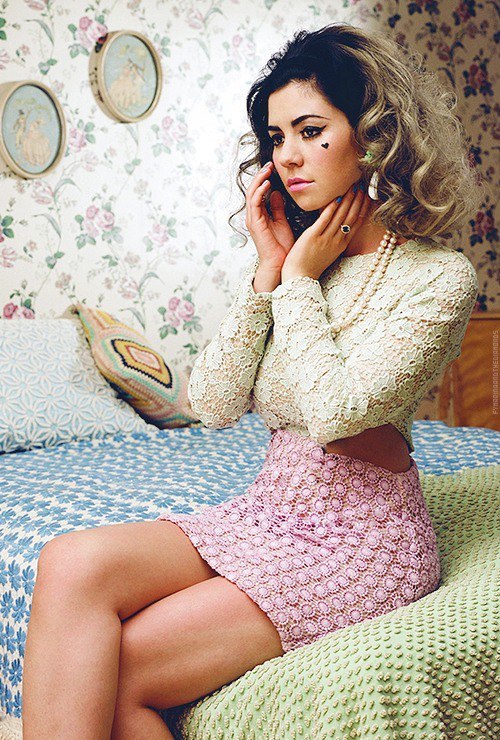
I used this photo of marina and the diamonds because it is similar to the one used of the girl on BAZAAR magazine. Also I want to use Marina and the Diamonds in my magazine.
I used the font Constantia as it was simple yet it looked stylish. The name also added a sense of glamour and mystery.
I put the barcode here as this is where BAZAAR put theirs and i liked their layout, also it it visible yet it doesn't take the focus away from the rest of the magazine.
I then added this text because i thought it was relevant explaining who is on the cover. I also wanted it shaped to her body to emphasize her curvaceous figure. The use of the Blue text took the harshness out of the black and white, it also drew attention to the name of the artist.
Finally i added the date, price and issue number. The date fitted underneath the T and E in the title. The issue number and price both fitted along the top of the barcode so it looks neat and visible however, its out the way. The font was small so it fitted neatly in smaller paces as it was not the main focus of the cover.
We started off by using a blank background before we added anything to it.
I used the font Constantia as it was simple yet it looked stylish. The name also added a sense of glamour and mystery.
I put the barcode here as this is where BAZAAR put theirs and i liked their layout, also it it visible yet it doesn't take the focus away from the rest of the magazine.
I then added this text because i thought it was relevant explaining who is on the cover. I also wanted it shaped to her body to emphasize her curvaceous figure. The use of the Blue text took the harshness out of the black and white, it also drew attention to the name of the artist.
Finally i added the date, price and issue number. The date fitted underneath the T and E in the title. The issue number and price both fitted along the top of the barcode so it looks neat and visible however, its out the way. The font was small so it fitted neatly in smaller paces as it was not the main focus of the cover.
Thursday 22 January 2015
Wednesday 21 January 2015
Page Harmony:
- The larger rectangle on the top left shows where the title or the first letter of the title should sit.
- The small Rectangle on the bottom shows were a barcode should be placed.
- The line across the center in the middle of the two circles show the main area of focus for the eyes. It roughly runs along the line where her blue from her jumper ends and meets her skin.
- The to circles also show points of focus as the first is on her elbow crease and the second is in the corner of her arm and shoulder.
Tuesday 20 January 2015
Monday 19 January 2015
Photographers:
Rankin:
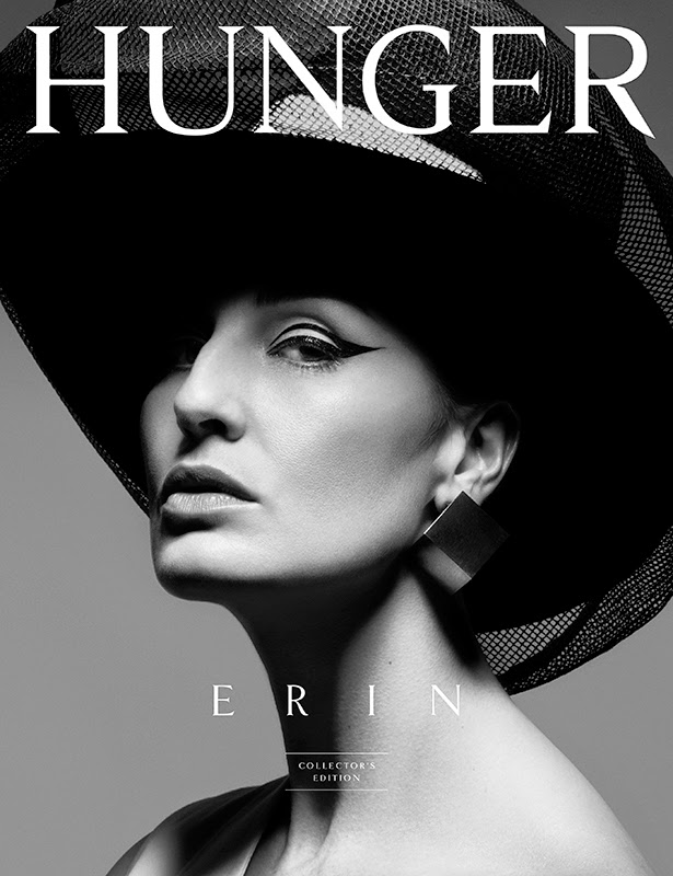
I have researched Rankin and his photography. I like the basic use of black and white however his photos stand out and make a statement. I hope to use this when taking my photos however, I will use colours instead of the image being in black and white. His photography is popular for Hunger magazine covers, as I know his photography is successful as a cover photo I know I can base my cover photos around his work. His photos let the models beauty stand out which is something i want to achieve in my photos of my artist and beauty and sophistication links to my chosen audience.
Sunday 18 January 2015
Fonts:
Possible fonts for my magazine title:
POSH
This Font is Batang.
POSH
This font is BatangChe.
POSH
This font is Constantia.
POSH
This font is Courier New.
POSH
This font is DFKai-SB
POSH
This font is Iskoola Pota.
POSH
This font is Microsoft Yi Baiti.
POSH
This font is MS PGothic.
POSH
This font is PiMingLiU- Ext B.
POSH
This font is Times New Roman.
Audience UK Tribes Research:
I want my magazine to attract different variety of audiences.
Young Alts:
Young alts experiment with different fashion types making them a possible audience for my magazine, as my genre might interest them. The retro look is a different fashion that might inspire them. They are also into Heritage bands, so they might be interested in Marina and the Diamonds or Florence and the Machine.
Indie Scenesters:
These might also be a possible audience and they are looking out for new music types and genres. They like to be different and ahead of everyone else with a passion for music. Doing this they also like vinyls and records which are a retro aspect
Creatives:
They are into working hard and being creative. My chosen music style is one that requires imagination and thought, making creatives possible readers as they might be interested in new creative things to work on. The different patterns and fashion styles might influence their art and design.
RAH's:
These might also be attracted to my magazine because they like splashing the cash and heritage clothing, the fashion style i am using in my magazine might intrigue them for style inspiration. My magazine will have a pampered, sophisticated look attracting these 'Daddy's girls'.
Relevant Fashion Style Associated with Music Genre:
Marina and The Diamonds:
Marinas fashion style is retro, classy and cartoonish. Her unique clothing textures and patterns add a touch of freedom but give a sophisticated look.
Her hair is unusual as she has died it half blonde, blue/blonde adding a sense of wildness to her look.


Lana Del Rey:
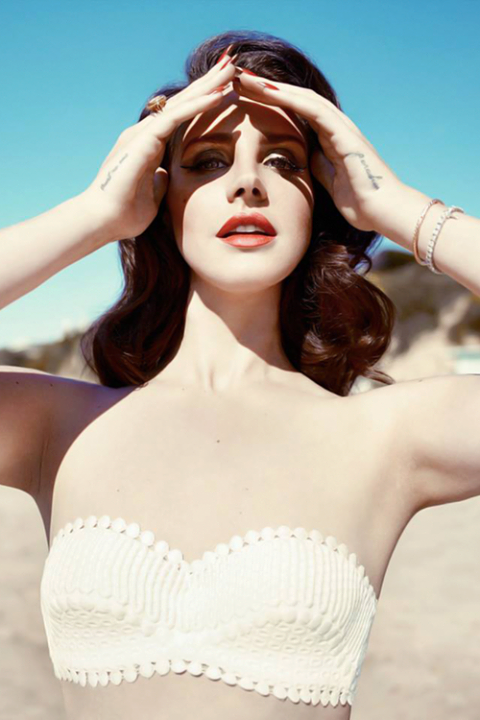
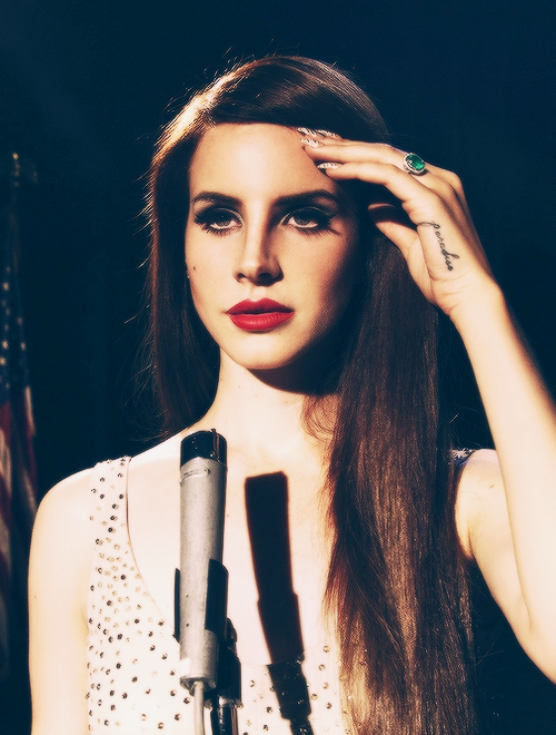
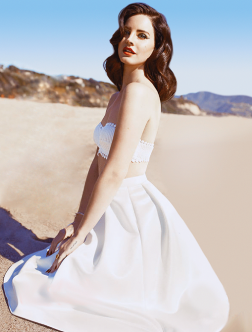
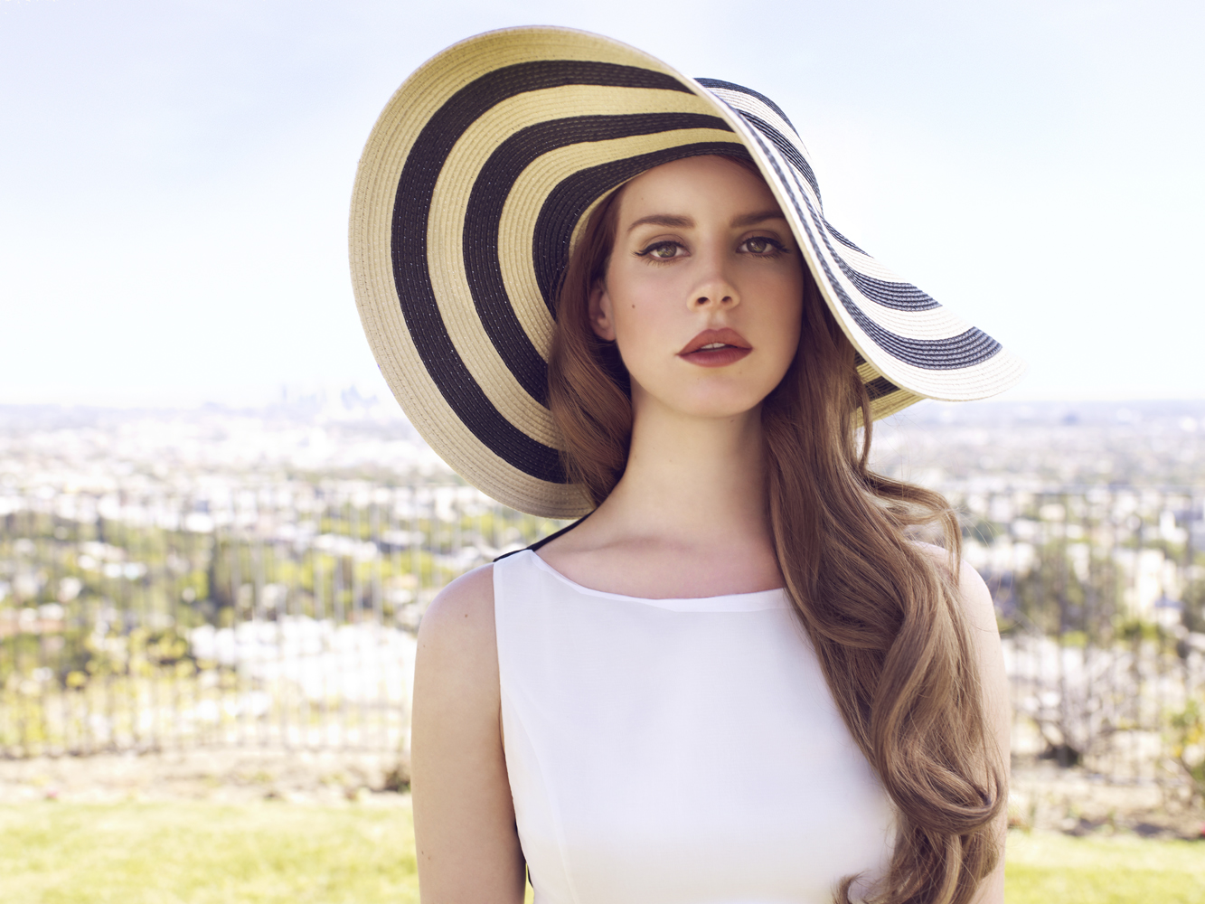
Lana's dress style is alike marinas in the sense that it is unique and retro. However, Lana brings more of a smooth, lounge singer feel to her wardrobe.
Her hair and make up also bring this feel as she has heavily made up lips and glossy curly hair.
Florence and the Machine:
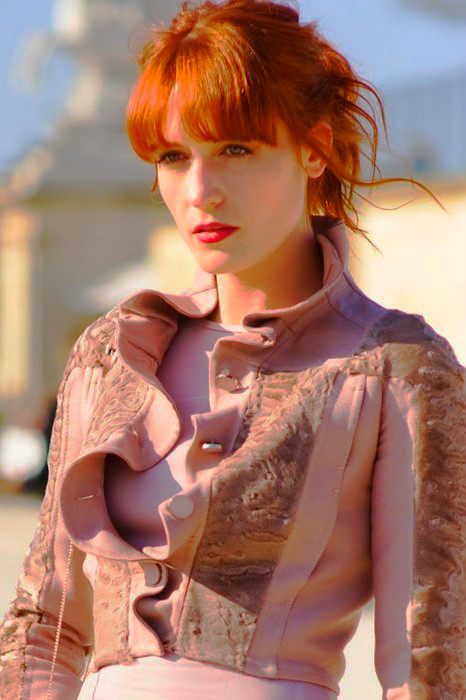
Florence's fashion style is vintage and unique. She wears prints, many blouses and her clothing items are usually bouncy and light. Her vintage look also has a hippie feel with the blouses in colours such as brown and red, this is a smooth relaxing colour scheme.
Her hair and make up is unique as she has red hair and a fringe above her eyebrows, she also wears red lips making them stand out.


FKA Twigs:
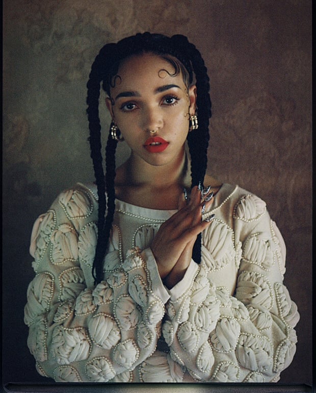
FKA's fashion style is unique with modern and old twists. Her clothes usually consist of bold colours, patterns and decoration. Her style also has a sense of freedom.
Her hair is usually in plaited buns and pigtails showing her wacky freedom and thoughts. Her lips are also made up to draw a look of sophistication to her face.


Influences:
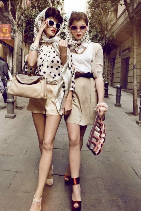
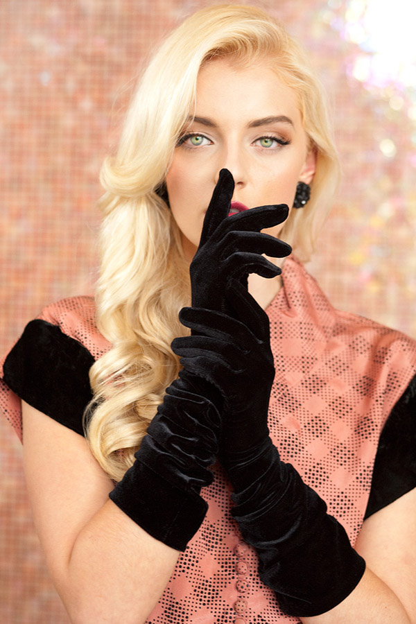
People who have been influenced by, are into this music genre, and like the retro look, have similar looks adding their own unique aspects and sophistication to there wardrobes. Their clothes insist of fur, patterns and light items. They also wear made up lips to add definition to their lips.




Marinas fashion style is retro, classy and cartoonish. Her unique clothing textures and patterns add a touch of freedom but give a sophisticated look.
Her hair is unusual as she has died it half blonde, blue/blonde adding a sense of wildness to her look.


Lana Del Rey:
Lana's dress style is alike marinas in the sense that it is unique and retro. However, Lana brings more of a smooth, lounge singer feel to her wardrobe.
Her hair and make up also bring this feel as she has heavily made up lips and glossy curly hair.


Florence and the Machine:
Florence's fashion style is vintage and unique. She wears prints, many blouses and her clothing items are usually bouncy and light. Her vintage look also has a hippie feel with the blouses in colours such as brown and red, this is a smooth relaxing colour scheme.
Her hair and make up is unique as she has red hair and a fringe above her eyebrows, she also wears red lips making them stand out.


FKA Twigs:
FKA's fashion style is unique with modern and old twists. Her clothes usually consist of bold colours, patterns and decoration. Her style also has a sense of freedom.
Her hair is usually in plaited buns and pigtails showing her wacky freedom and thoughts. Her lips are also made up to draw a look of sophistication to her face.


Influences:
People who have been influenced by, are into this music genre, and like the retro look, have similar looks adding their own unique aspects and sophistication to there wardrobes. Their clothes insist of fur, patterns and light items. They also wear made up lips to add definition to their lips.


Chosen Title of Magazine:
POSH
I have chosen the name posh as my magazine title:
The name posh is pop and ssh combined, as my chosen music style is indie pop and the vocals within this genre are unique and sometimes hushed. Whispering is a different way of using your voice which is what the shh means. I feel this goes with my chosen genre as the music is inventive. Indie pop one of my chosen genres consists of different music styles, my title consists of two different words. Posh is usually linked to the idea of sophistication, which is what my chosen music artists have within their music and look. People who are thought to be posh have more freedom to do things then other people, as people think them to have money and luxuries. This also links to my chosen music genres as the artist have freedom with their music and don't have to stick to one specific musical style.
I have chosen the base my magazine cover on BAZAAR magazine, as their name is unique and is a word used to describe something. Therefore it is a good choice as it as indie aspects. The look used in BAZAAR magazine also has a retro, sophisticated look which links to the look of my chosen music genre and i will use this to add my own unique twist.
This font may be used on my magazine as it looks clean and neat however, it also has a sophisticated feel to it. Each letter has been neatly drawn and had thought put into, which links to the thought that goes into the music my chosen artists create. The title also allows itself to attract readers who are interested in certain aspects. I wont my font to make the title flow and look smooth among my image, as Lana Del Rey and Florence and the Machine who are two of my chosen artists, use a smooth, lounge, classical feel to their music. This is what i want my title to have a feel of with look and sound.
Saturday 17 January 2015
Analysis of Magazine Covers:

Colour Scheme:
The Colour scheme used is mainly black, white and red. This is a common colour scheme as the colours compliment each other. gloomy however it shows beauty. Black and Red are the dominant colours on this cover, this would draw an audience as the two colours together are very powerful. The red is repeated in the title, her lips and the shadow image, these then create key areas to focus on. The black and dark colours give a nervy mysterious look standing out from the red and white colours, therefore intriguing audiences. Although the dark colours look gloomy, the light colours then show beauty, focusing on the natural beauty of the girl, and green highlighting the nature. The small white writing at the bottom compliments the black as they are on opposite ends of a colour chart, making the black and the writing stand out.
Picture:
The picture used works well because the colours used among the girl and back ground mean the girl does not blend into the back ground. Both stand out clearly however, the main focus is on the girl. The quality of the photo is spec-ally showing slight traces of scratches, this makes the photo look dated giving it a retro feel, this might attract audiences who have certain vintage fashion interests as the girl is also wearing vintage clothing. like the fact that there is different tonnes of brown in her hair making the magazine feel more natural and not only using precisely blocked colours. The shadow girl in the picture might attract to people who are interested in photography, as it has used Photoshop and camera techniques.
Title:
The light colours used in the center of the cover draw attention to the girls face as it is the main focus and to the title. The red shows clearly on top of the girls hair and face which is dark and light, this colour was chosen as it was used in other parts of the cover showing a flow. The placing of the title corresponds with the image as they are symmetrical and central. Other covers created by Lula magazine use titles that are in different places in a variety of colours, each title is in a colour that corresponds with the images colour pallet. The title fits the magazine as there is a young, pretty girl on this cover and other covers, Lula is also a pretty girls name. The font is flowing, simple and pretty, this links to the beauty within the cover and also it is easy to read.
Barcode:
The barcode is very small vertically on the edge of the magazine. Having it vertically means it isn't in the way of the small writing at the bottom. This also gives the impression that the barcode doesn't want to have attention drawn to it as it is not a main focus. The cover has a vintage look to it so the modern barcode may want to be hidden as it takes away part of the old feel.
Opinion:
Overall i like the repetitive colour pallet choosing making the title clear but not stick out for the wrong reasons. I also like the image gives an unique, uncomfortable feeling attracting intrigued readers. Also i like the colours complement each other so everything is clear but the main focuses are not lost.

Colour Scheme:
The main colours used are white and blue, these two colours compliment each other very well. There is also a small amount of dark and yellow, neither of them contrast against the other two. Blue is mainly used as the back ground, in the sky and the water, however they are both different shades of blue so it is clear to understand the image. White shows very well over the blue and is used repeatedly, in the writing, skin, swimsuit and barcode. The colours used give everything a clear outline, making it easy for the reader to notice and read. The colours used are very relaxing and clean which make the cover bright ad eye catching. However the small uses of other colours such as yellow, red and black are effective as they take away the intensity of the solid black and white colour scheme. Also they do not clash with the other colours or look too bold.
Picture:
The picture used is clear as the same few colours are used in the same elements of the photo. For example, the water includes blue and white and the lady includes blue and white. This makes the parts of the image fit together. The woman has pale skin and is wearing a white swimsuit, this draws attention to her and what she is doing, attracting readers who want to read on holidays or leisure. Her body is almost in the center of the cover making it look symmetrical and more of a focus to the reader. The darker blue swimming hat is on top of the lighter blue sky, therefore it is clear. The objects in the image are similar height making them easier to see and it makes the image look neater.
Title:
The title is white which shows up clearly over the blue, making it easy to read, and look neat and simple. The letters are mainly the same width at the top and look fitted to the top of the cover. There is small white writing in the middle of a gap filling in the empty space, making the magazine look organized and well thought out, also it draws more attention to the title. Other titles on BAZAAR magazine covers are in the same place, which looks repetitive and neat. However, the titles are different colours, as the colour of the title goes wit the colour pallet of the image. The name BAZAAR suits the magazine as the cover images and what the magazines include are different and unique. The font used it straight and simple making the letters look rectangular, flowing with other rectangular elements of the cover. This also makes the title easy to see and read.
Barcode:
The barcode is well placed as it is horizontal on the bottom left corner. This a good position as it is inline and looks similar to the smaller white writing flowing down the left hand side. It is not too small making it visible but not drawing too much attention to it.
Opinion:
Overall i like the simple yet effective colour scheme used, everything has a clear outline and nothing clashes on top of each other. I also like the layout is neat using long, rectangular bases shapes. I really like the way it is clear what order the elements are supposed to draw your attention. The image ad background catch your eyes first, then the title and then it flows down.

Colour Scheme:
The main colours used in this colour scheme are yellow, white and blue. The title is the boldest colour in yellow however, the yellow drink in the glass makes it less less noticeable that it doesn't go with much else on the cover. Yellow stands out easily over dark green, this makes the title eye catching and easy to read to an interested viewer. The yellow drink in the glass is over Marilyn's pale body also making it stand out. Her pale body is also clear to see as it stands out in front of the blue water, this will get the readers attention as they will want to know who the person is featuring on the cover. Small white writing is used in various places around the cover, it is clear and readable, even though it is on top of different colours. White shows up clearly over most darker colours, so it is noticeable over green and blue.There is small elements of darker colours used on the cover which removes the brightness of the magazine as it is placed in the lighter more eye catching sections, it will also get noticed more.
Picture:
The picture on this cover is clear and the different colours have a sharp outline they don't clash with each other. The background is symmetrical and fills the page, as the line showing the water from the trees is straight across the magazine making it look neat. Marilyn's body and swimsuit is also symmetrical, as both shoulders are roughly the same height either side and her swimsuit is the same style on either shoulder. Her streaky, white, wet hair also goes with other light elements of the cover and writing. As the streaky lines in her hair go with the white letters used in the writing. The bottom half of the images is linked and flows as same few light colours are used, and the top half is mainly two block colours. This means that the area of focus is the bottom half. As the drink, person and water are where the readers will be most interested.
Title:
The title is clear and doesn't draw too much tension away from the image as it uses another colour shown on the cover. As yellow is still a bright and unique colour to have as a title, it will stand out from other magazine overs and titles, making readers more likely to pick this magazine up first. The title is neatly placed in the middle on the top of the cover, the edges are the same distance apart, following the shoulders and swimsuit. The font has a unique swirly, thick look to it but it is still easy to read. Other titles used but Esquire magazine covers are in the same place however, they are different colours as the colour of the title goes with the colour scheme used in the cover image.
Barcode:
the barcode is in a good place as it it vertical in the right bottom corner of the cover. This is a good placement as the barcode allows the eyes to flow from the shoulders to the barcode however, it doesn't stand out near the image making it look out of place. It is also the same height of the shoulder, making it blend in with aspects of the cover.
Opinion:
I like the bold choice of using a yellow title as yellow is only used once in the cover image however, it still blends and stands out. I also like the brighter colours to be near the body making Marilyn stand out to an audience intriguing them into who she is. I like also the placing of the barcode and how it makes the eye flow to things in order of importance, you are drawn to the title, then the body and then your eyes go to the barcode and small writing.
Analysis of Music Genre:
The music Genre i have chosen is Indie pop and alternative, art rock.


Marina and the Diamond's songs are indie pop and new wave, however she also includes elements of electropop. Marina described herself as a 'DIY musician' and an 'Indie artist with pop goals'. Her music style is different as she had no musical training. Marina's songs are also deep and have underlying meanings, she said if her music career wasn't successful she would have been a psychologist, also using her deep thoughts and mind. The notes she sings in her songs are 'inventive'. Marina's musical influences are Brody Dalle and Britney spears.

Lana Del Rey's songs are cinematic involving the pop culture of the 1950's and 1960's Americana. The Rolling Stones described her as a 'Lounge singer'. She chose her musical identity as it reminded her of going to the sea side and also it sounded beautiful coming off the tip of the tongue. Her movie 'Hollywood and 'Movie music' have even been know to show elements of hip hop and rap. Lana' songs also link to various genres of baroque, rock and indie pop. Her musical influences are Elvis Presley, Antony and The Johnsons, Frank Sinatre, Eminem and Amy Winehouse.

FKA Twig's music style is Catchy, Indie pop. Her music includes whispered tones and it has been compared to the work of Tricky. FKA's musical influences are Billy Holiday, Ella Fitzgerald and Marvin Gaye. She said her songs are not restricted to one specific music genre and can explore aspects of different music genres and sounds. Her sounds incorporate everyday sounds such as car alarms.

Florence and The Machine's music style is dark, robust and romantic, this genre is classical and art rock. Florence includes many of her feeling and emotions in her songs bringing passion to her music, envolving lyrics saying we are all dealing with 'love and death, time and pain, heaven and hell'. Her work as been compared to Kate Bush, Siouxsie Sioux and PJ Harvey. Florence's musical influence and hero is Grace Slick.

Lana Del Rey's songs are cinematic involving the pop culture of the 1950's and 1960's Americana. The Rolling Stones described her as a 'Lounge singer'. She chose her musical identity as it reminded her of going to the sea side and also it sounded beautiful coming off the tip of the tongue. Her movie 'Hollywood and 'Movie music' have even been know to show elements of hip hop and rap. Lana' songs also link to various genres of baroque, rock and indie pop. Her musical influences are Elvis Presley, Antony and The Johnsons, Frank Sinatre, Eminem and Amy Winehouse.

FKA Twig's music style is Catchy, Indie pop. Her music includes whispered tones and it has been compared to the work of Tricky. FKA's musical influences are Billy Holiday, Ella Fitzgerald and Marvin Gaye. She said her songs are not restricted to one specific music genre and can explore aspects of different music genres and sounds. Her sounds incorporate everyday sounds such as car alarms.

Florence and The Machine's music style is dark, robust and romantic, this genre is classical and art rock. Florence includes many of her feeling and emotions in her songs bringing passion to her music, envolving lyrics saying we are all dealing with 'love and death, time and pain, heaven and hell'. Her work as been compared to Kate Bush, Siouxsie Sioux and PJ Harvey. Florence's musical influence and hero is Grace Slick.
Thursday 15 January 2015
Analysis of Colour Palettes:
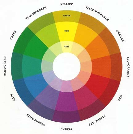
Magazines need colours that compliment each other, for example the most common colours are black and white because they are easiest to read. However, other colours can compliment each other but its risky.
colours can be added to black white which can still compliment them,
for example.
- Black, White and Blue.
- Black, White and Red.
- Black, White and Yellow.
- Black, White and Green.


However black and white don't necessarily have to be used together,
for example.
- Black and Yellow.
- Red and White.
- Green and Orange.
- Yellow and Blue.
- white and Green.
- Green and Yellow.
- Orange and Black.
- Yellow and Red.
- Blue and White.


I would like to use either
- Black, White and Red.
- Black, White and Gold.
- Black and White.
Red is used to represent danger and love. However, gold is used to represent wealth, money or independence.


Subscribe to:
Posts (Atom)


